Here at Supply Chain Digest, we look at a lot of charts both generally in various reports and articles and especially for this popular “Graphic of the Week” feature.
Occasionally in that pursuit, we find a chart that however well meaning by its creator, is simply impossible to comprehand, at least without deep scrutiny. Over the years, we have published a few of them as a example of what not to do. We believe a data chart should should tell the story quckly and simply, because the audience will decide if its worth the effort to understand what it is trying to tell us in about two seconds.
We love the good folks at ocean container analyst firm Drewry, and frequently cover their often interesting Container Insights blog.
In doing just that this week, we found the chart below from the latest post, which we will nominate for incomprehensible status.
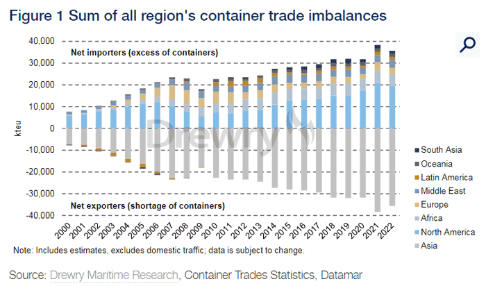
It uses a stacked column chart that tries to show the ocean container balance positive or negative, based on imports and exports for eight regions across the globe for the last 22 years.But what to make of the data in the coumns is simply beyond us. Quick, tell us what the trends in Europe are, for example.
Good luck.
Any reaction to our Supply Chain Graphic of the Week? Let us know your thoughts at the Supply Chain Graphic of the Week: A History of US Manufacturing Jobs button below.
Your Comments/Feedback
|