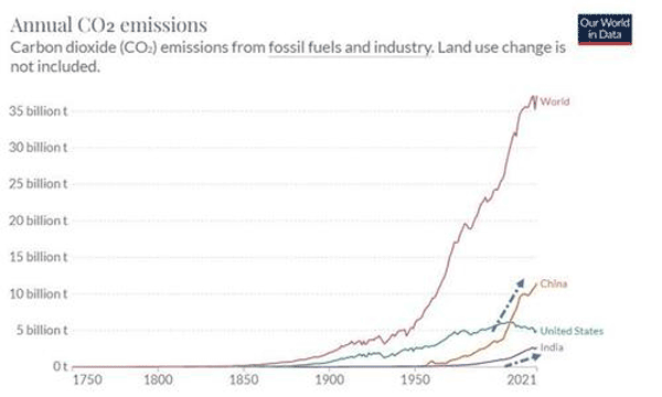
This week, an aticle on the web site zerohedge.com included this chart, which shows the growth in CO2 emissions overal and for the US, China and India specifically. (The source of the data is not clear.)
Source: ZeroHedge.com
Assuming the data is accurate, a couple of observations: First in general the level of CO2 just continues to rise. Second, the US is trending different than most, with emissions recenty declining. Third, while China and India show rising emissions, the "rest of world" emissions dwarf the levels of those two emitters alone.
Any reaction to our Supply Chain Graphic of the Week? Let us know your thoughts at the Feedback button below.
Your Comments/Feedback
|