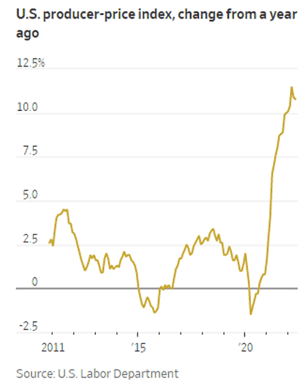
We all know inflation is soaring, confirmed again this week, with a year-over-year rise in wholesale prices of a scary 10.8%, as measured by the Producer Price Index (PPI).
That was about the same as the 10.9% rise in April, in numbers not seen in 40 years.
But this has been building for some time - since a few months into rhe pandemic in Q2 2020, as seen in the graphic below:
Source: Wall Street Journal
As can be seen, on a year-over-year basis each month, the graph goes almost staight up since shortly after the start of the pandemic.
How long will it last is the question of the day - and is the only solutuion a recession?
Any reaction to our Supply Chain Graphic of the Week? Let us know your thoughts at the Feedback button below.
Your Comments/Feedback
|