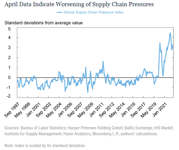
In January, New York Federal Reserve Bank researchers Gianluca Benigno, Julian di Giovanni, Jan J. J. Groen, and Adam I. Noble announced they had developed a new tool to measure the state of the global supply chain environment.
Their Global Supply Chain Pressure Index combines 27 variables that take the temperature of everything from cross-border transportation costs to country-level manufacturing data in the euro area, China, Japan, South Korea, Taiwan, the UK. and the US.
The data sources used in the index include:
• The Baltic Dry Index that tracks the cost of shipping raw materials such as coal or steel
• The Harpex, which tracks worldwide price trends in the charter market for container ships
• The US. Bureau of Labor Statistics’ indexes that measure changes in air-freight rates to and from the US
• Purchasing Managers Index surveys from several countries, and for the US the PMI from the Institute for Supply Management and its measures for new orders, delivery times, backlogs and purchased inventories
The index value is measured by the number of standard deviations from average levels of pressure historically.
The Fed economists actually compiled data going back to 1997. They released an updated index and chart in March, and then another this week, as shown in the graphic below:
Global Supply Chain Pressure Index for April, 2022

After peaking in December 2021, the GSPI had been falling a bit though March, then jumped back up a bit in April. Why? The May report says "the worsening of global supply chain pressures in April was predominantly driven by the Chinese “delivery times” component, the increase in airfreight costs from the United States to Asia, and the euro area “delivery times” component.
The researchers also annouced the report from here on will be published every month.
What to do with it? We're still not quite sure yet, but we'll keep tabs on it.
Any reaction to our Supply Chain Graphic of the Week? Let us know your thoughts at the Feedback button below.
Your Comments/Feedback
|