Off and on over a number of years, SCDigest has published examples of what we usually call "incomprehensible charts" - usually visually appealing graphics that you have to look at a long time before you can figure out what it is trying to communicate.
Our perspective is that the number of incomprehensible charts is on the rise. The cause: the widespread availability of a new generation of data visualization tools, which create great power and opportunities for creativity - maybe far too much.
A fresh example is the chart below, from the smart consultants at McKinsey, from a recent article on procurement practices:
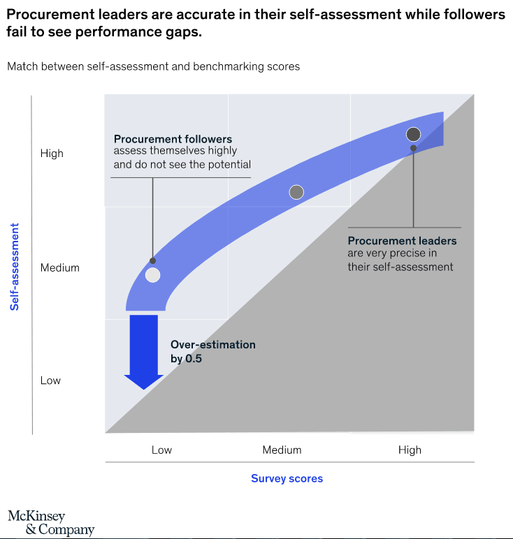
If you can look at this chart and know right away what it is communicating - key to a great chart - your smarter than us here at SCD. We struggled to figure out what the thing that looks like a boomerang is telling us.
And after all that effort, we are told the low group has an "over-estimation" of 0.5 - with absolutely no context as to whether that is a lot or a little, and why it matters.
We're going to be on the look for more incomprehensible supply chain chain charts and plan to create a gallery of them. If you find any, let us know at the comment section below.
Your Comments/Feedback
|