It may not have a a direct connection to the supply chain, but we were interested nonetheless in the graphic below, which shows changes from 1970 to 2017 in the percent of Chicago city residents by income level in three segments: high income, low income, and middle class.
The data was recently presented by local TV channel WBEZ.
As can be seen, the higher and low income segments have grown, while the middle class in Chicago is almost gone, down to just 16% in 2017 from 50% in 1970.
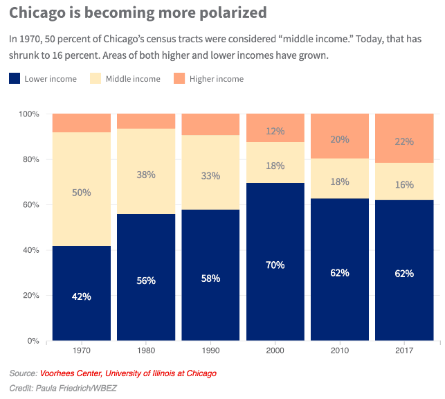
Where did the middle class go? To the suburbs, most likely, or perhaps out of the Chicago metro area all together.
But we think you connect this to supply chain in the end anyway.
Companies need to think in terms of two supply chains in Chicago proper, one for the very well off, and another for the large mass of low income residents.
Higher income areas, as just one easy example, likely will support rapid ecommerce deliveries that come at a cost, while low income neighborhoods cannot afford to pay for such convenience.
To that we will add the old but very true axiom: Demography is destiny.
Any Feedback on our Supply Chain Graphic of the Week? Let us know your thoughts at the Feedback section below.
Your Comments/Feedback
|