It was a blow out jobs report for February, with over 313,000 new jobs created, for above expectations and sending the stock market up.
But beneath that headline news, what else is happening? It's almost all good news, as shown in the five charts below, as summarized by the Wall Street Journal.
Wage growth is finally picking up some steam. The chart below shows hourly and weekly wage changes along with inflation rates. In recent months wages have been moving up after years of stagnation - but so is inflation. Of course the two may be linked.
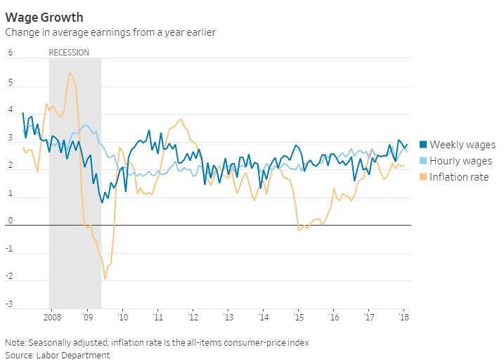
Source: Wall Street Journal
Wokrforce participation rates - meaning workers with a job or searching for one - have been trending up nicely for two years, partly driven by expanding payrolls but also because that is driving more unemployed people in the US to again start to look for work.
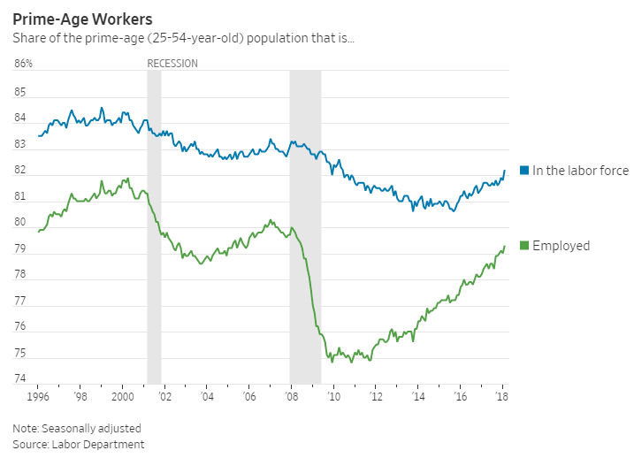
Source: Wall Street Journal
The strong labor market is driving down unemployment rates for everyone. Black and Hispanic unemployments rates are at record lows, though still high compared to whites and Asians.
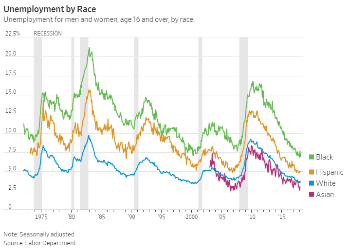
Source: Wall Street Journal
Job growth is generally broad across US industry sectors, though services of various kinds clearly lead the way. Noteworthy to us is the low growth in retail jobs, which are usually strong in periods of overall jobs gains, as well as the low increase in government jobs.
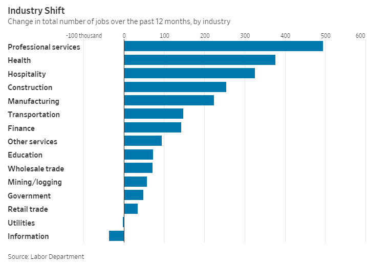
Source: Wall Street Journal
College graduates now have an unemployment rate of just 2% - we bet it's even lower for supply chain majors - but even those without a high school degree are seeing their unemployment numbers fall sharply.r
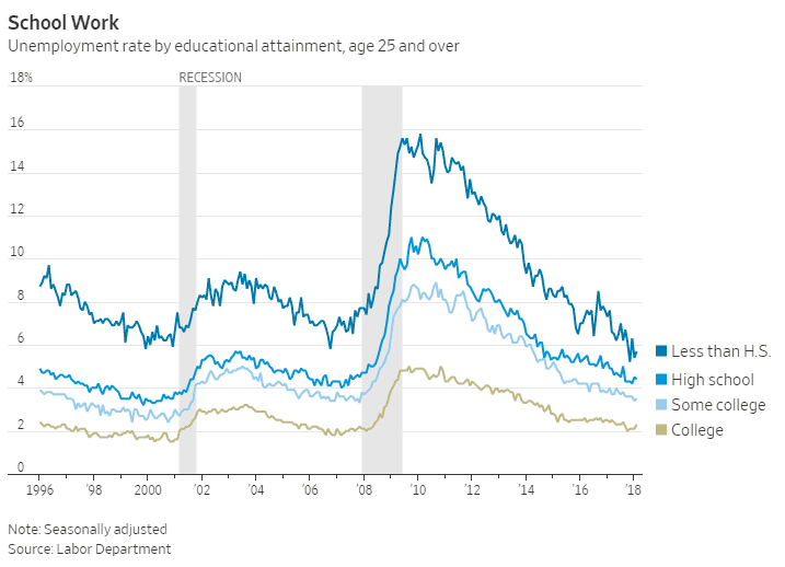
Source: Wall Street Journal
How long can the good times roll? Who knows - let's enjoy while it lasts.
Any Feedback on our Supply Chain Graphic of the Week? Let us know your thoughts at the Feedback section below.
Your Comments/Feedback
|