President Trump was elected in large part on his promise to revive US manufacturing, and blaming much of the US decline in manufacturing on too many imports resulting from bad trade deals, currency manipulation and more.
But what exactly is the relationship between import volumes and US manufacturing output?
In a recent blog post, noted economist Alan Reynolds, now of the libertarian-oriented The Cato Institute, published the chart below in an attemp to answer that relationship question.
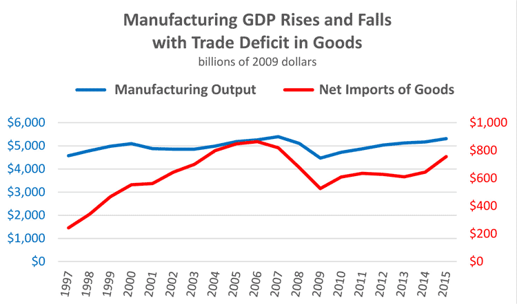
Relative to this data, Reynolds wrote: "As the graph clearly shows, the real gross output of US manufacturing rises when the goods trade deficit (both measured in 2009 dollars) is also rising. When trade deficits fall, so does US manufacturing. Sinking industries need fewer imported parts and materials, and their unemployed workers can’t afford imports."
With all due respect to Mr. Reynolds, who has done great work over many years, we say "Huh?"
From SCDigest's view, , the immediate takeaway from this chart is that from roughly 1997-2005, US imports soared while US manufacturing flatlined, hardly marching in lockstep, as Reynold's analysis indicated.
For the next 5 or so years, the two measures did move roughly together, but then from 2010 to 2014, imports slumped and – surprise! – US manufacturing showed growth.
Then in the last few years imports are again rising - and US output is again flat. All this more supportive of Trump's case, though there are many sides to this issue.
So are we nuts, or is Reynold's in need of new spectacles? Please offer your interpretation.
Any Feedback on our Supply Chain Graphic of the Week? Let us know your thoughts at the Feedback section below.
Your Comments/Feedback
|