Last week, SCDigest editor Dan Gilmore wrote his First Thoughts column on the amazing collapse of most input, commodity and some logistics prices ove rthe past couple of years. (See The Collapse in Input Prices - What Does It Mean?)
That column contained a number of charts illustrating that price collapse, and links to a few others, but there wasn't room enough for all of them. Below you will find the full set.
Oil was actually very steady in the $90-100 per barrel range from 2011 through the first half of 2014, and then pow - a 70% or so drop a bit above $30 now for about three months. And of course, that is down 80% from $140 or so we saw in July of 2008.

The same basic story for natural gas, where generally the price is lower in the US than most of the rest of the world. As you can see in this chart, natural gas prices have fallen from $6.61 per million BTUs in 2011 to about $1.75 currently - a decline of an astounding 74%. Reached a 16-year low this week.

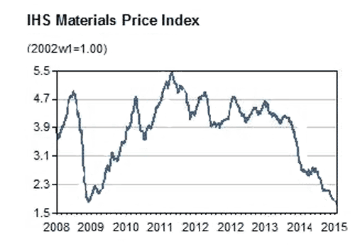
The IHS Materials Price Index - which tracks a basket of commodities - is
down about 60% just since July 2014, as shown below, and is now down
past levels seen at the bottom of the Great Recession in 2009 to even
lower 2003 levels.
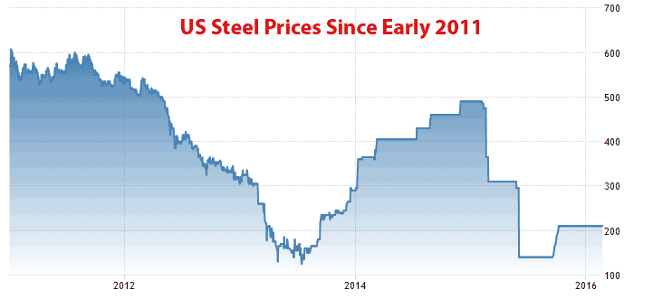
The price of steel has really collapsed, falling by two-thirds since the $600 per ton level reached in early 2011 to about $200 today. In June of 2008, the price was about $1265 - an amazing six times today's prices.
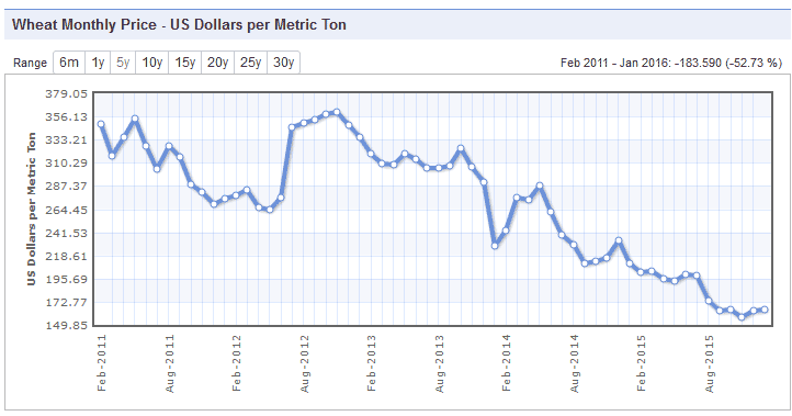
Many agricultural prices are also in the toilet.
For example, wheat was $361 per metric ton in late 2012. It is now down
more about 55% since then, at $164. It saw its all-time high of $439 in
June of 2008 - nearly three times the current price.
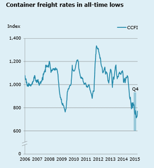
Container shipping rates have also cratered,
reaching modern all-time lows late in 2015, below variable costs to
operate a ship and down by about 50% from 2012 levels, as you can see in
the chart here that tracks the China Containerized Freight Index.
Perhaps the most astounding price story of all are
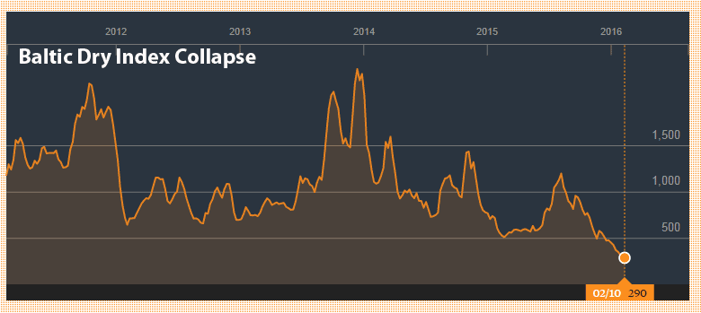
the rates for bulk shipping of commodities, as is reflected in something
called the Baltic Dry Index. In December 2013, that Index stood at
2330; it was at 290 last week- an almost unimaginable 88% decline.
And finally, rates on US Treasury Bills have also tumbled, falling from around 3% at the beginning of 2014 and 3.5% in 2011 to about just 1.8% currently for tying up your cash for 10 years..

What in the hell is going on in the seemingly decent economic times? These numbers certainly could be presaging a major economic downturn.
Any Feedback on our Supply Chain Graphic of the Week? Let us know your thoughts at the Feedback section below.
Your Comments/Feedback
|
|
Max
Not Provided, Not Provided |
Posted on: Mar, 07 2016 |
|
You should not take short term peaks as reference values. If you take the Baltic Dry Index, you could as well say: What was going on in Q4 2013, when prices doubled within 2-3 month. The same holds for container freight rates. Further, cutting this graph at 500 makes a the variance appear much biggher than, in relation, it really is. But for sure, the general message is right, the prices are down. |
|
|