SCDigest publishes a steady stream of excellent charts in our Supply Chain Graphical of the Week feature.
But once in awhile we find one that simply defines comprenshension and point that out. That was was the case with the graphic below from an an otherwise solid report on warehouse robotics from the highbrow consultants at McKinsey last December, which we ran into this week:
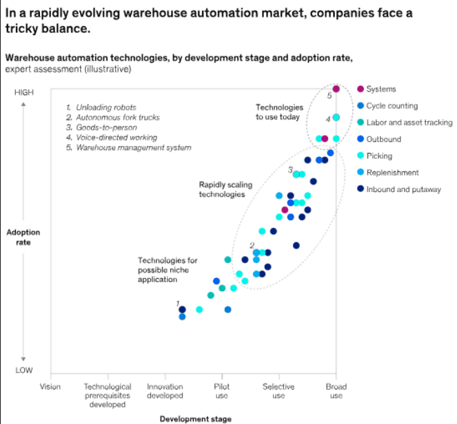
Source: McKinsey
After studying it for quite a while, we sort of mostly figured it out, but it was simply too much work. A graphic should easily communicate information, not make deciphering it a challenge. Far too many dots.
Any Feedback on our Supply Chain Graphic of the Week? What do you think of this contributor list? Let us know your thoughts at the Feedback section below.
Your Comments/Feedbackh
|