SCDigest publishes a steady stream of excellent charts in our Supply Chain Graphical of the Week feature.
But once in awhile we find one that simply defines comprenshension and point that out, as was the case with the graphic below from the UK's well-known Financial Times, attempting to somehow explain trade flows in the global market for cotten:
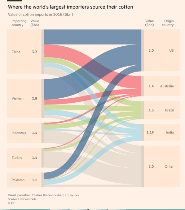
Apparently the abstract painting there in the middle is meant to tell that story, but it might instead be the most confusing chart we have ever seen.
Any Feedback on our Supply Chain Graphic of the Week? What do you think of this contributor list? Let us know your thoughts at the Feedback section below.
Your Comments/Feedback
|