There is no shortage of chart on the spread and deadly results of the coronavirus - many if not most a little hard to understand.
Not so with this simple chart from the UK's Financial Times, showing the tragic deaths by state from the virus thus far, based on data through April 8th.
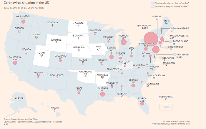
Source: Financial Times
What immediately stands out of course is the huge toll in New York, with more than 6000 fatalities. That is far more than the virus deaths in all the other states combined.
We are told in much of the country the peak is near. Let's pray that's so.
Any Feedback on our Supply Chain Graphic of the Week? What do you think of this contributor list? Let us know your thoughts at the Feedback section below.
Your Comments/Feedback
|