We use a lot of graphics here at SCDigest. In fact, our “supply chain graphic of the week” article in each Thursday’s newsletter is one of our most popular features.
That has caused me to look at chart formats more closely, and read with interest a number of charting web sites and blogs, of which there are more out there than you might think. And since our readers often need to use charts in presentations, I thought a few words on this topic might be apropos.
Here is what I have learned – what looks “pretty” is often terrible at communicating information.
The chart web sites are especially hard on the graphics used by newspapers, such as USA Today or the New York Times, as being especially egregious examples of nice looking but ultimately really bad charts.
So with my chart antennas up, I found last week this chart from Nielsen, the research company that studies both our television watching and retail shopping habits.
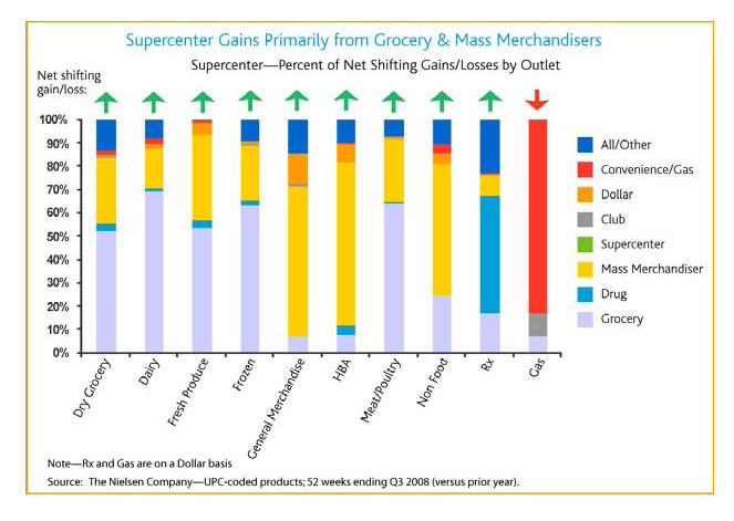
This chart purports to show information about a topic I am interested in, the changes in volumes for consumer goods manufacturers among different retail formats. The headline news was that in 2008, the only channel to increase unit volumes was supercenters, at the expense of traditional grocery and drug formats.
But while this chart (taken from a Nielsen press release) has pretty colors, if anyone can actually discern what the data tells you then you are certainly a better man or woman than I am.
If you have such a story, again we would love to hear it. |