Since 2005, I have been doing reporting and analysis on company and sector inventory levels based on the annual Working Capital scorecard that is compiled by REL, a division of the The Hackett Group.
It is always one of our most popular columns of the year.
Gilmore Says: |
 One thing that is really striking in doing this work is seeing in the resulting tables how concentrated so�many US business sectors have become. One thing that is really striking in doing this work is seeing in the resulting tables how concentrated so�many US business sectors have become.

Click Here to See
Reader Feedback |
Once again this year, REL has been kind enough to send me the data set for some further analysis. The just released 2014 data is based on year-end 2013 financials from some 1000 US public companies.
The full report and data set looks at the full spectrum of working capital: Days Sales Outstanding (DSO), Days Inventory Outstanding (DIO), and Days Payables Outstanding (DPO). Here, we are going to focus on just the inventory component.
DIO means how many days of sales a company is holding in inventory, and which REL defines as:
End of Year Inventory Level/[total revenue/365]
So, you calculate the average revenue for one day, and then see how many of those sales days you keep in inventory (based on year end balance sheet numbers).
As always, I want to make clear this is the definition that REL uses in its data set. Every year, someone writes in telling me DIO should be calculated differently, and my response is that this is the way REL calculates DIO, so that is what I must therefore use (and I think it is fine anyway). Also, REL must use DIO, not inventory turns, so it is compatible with the other two components of working capitol, Days Sales Outstanding (receivables) and Days Payables Outstanding. The main formula wouldn't work with a turns number.
As such, DIO is sort of the reverse of inventory turns, in that a higher DIO, all things being equal, means poorer inventory management performance, while a lower number signals improvement. You are being more efficient with inventory versus a given level of sales.
So, let's take an example. Food maker Kellogg had about $14.79 billion in sales in 2013. Divided by 365 days in a year, that means the company sold about $40.52 million worth of cereal, Pop Tarts and other stuff per day. It also ended the year with $1.284 billion in inventory. So dividing that inventory number by the $40.52 million in sales per day means Kellogg held on average inventory equal to about 30.7 days of its sales. Technology product company HP, by contrast, manages to hold just about 20 sales days worth of inventory. Nike held about 50 day's worth in 2013.
In case you were curious, Kellogg's 30.7 days of DIO could be compared to its inventory turns level of 6.96 days (cost of goods sold divided by inventory levels). But by no means can we say that every company with DIO of 30.7 has an inventory turn of 6.96. The margins/cost of goods sold vary by company, making that linkage impossible, unfortunately.
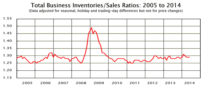
In the overall US economy, inventory levels have remain relatively flat since about 2005, when compared to sales. As seen in the chart below, the "inventory to sales" ratio did spike in late 2008/early 2009 as the recession caught companies with way more inventory than needed versus suddenly shrinking demand, but they then chopped away at that inventory ruthlessly, so that it was back on the longer term trend line by early 2010. However, according to this government data, inventory levels have actually been trending slightly up in recent periods, probably as top line growth becomes more and more the priority (note: this is a monthly measure, which is why it is greater than 1 - inventory/monthly sales).
Across all 1000 companies, REL finds DIO is up .3% year over year, .8% over the last three years, and 8.3% over five years. Interesting.
Now, back to the REL data. It is great, but the big value-add SCDigest performs here is to re-sort individual companies into new categories, so the categories and comparisons in our view are more usable for supply chain thinking. For example, home builders like Toll Brothers are mixed in the household durables category with companies like Whirlpool. That may have been the most "apples and oranges" combination, but there were a number of others that didn't jive, at least from a supply chain perspective. Metal producers such as US Steel were in the same category as miners.
So, we do the (really) hard work of first eliminating sectors that aren't useful for the supply chain (e.g., bankers, etc.), and then redefining and populating the categories in a way that makes more sense for the supply chain. As another example, rather than having one giant category of all specialty retail, we broke that down into apparel, office products, etc. It really does take a lot of time.
It is far from perfect. Should Johnson & Johnson be placed in the pharma group, the medical device category, or consumer packaged goods, as it does all of that? Is Honeywell in the aerospace or automotive sector, or one of the few "industrial conglomerates" like GE or 3M? That's where we put it again this year. There are many such examples.
In the end, we simply made choices, including looking up more details on a number of companies with which we were not familiar.
One thing that is really striking in doing this work is seeing in the resulting tables how concentrated so many US business sectors have become. Office products retailers? We're now down to two, after Office Depot swallowed OfficeMax. We have to put beer maker Molson Coors in with soft drink companies in a "beverage" category, even though the dynamics are very different, because there are no other public brewers to make even a two-company category. Alas.
So
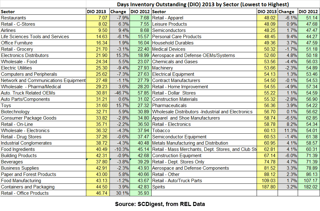
all that doesn't leave me much room here. You will find here a complete table
of the almost 60 categories we created, ranked from lowest DIO to highest,
and the change from 2012 to 2013: DIO By Sector 2013. I will also note these are unweighted averages, so a big change even in a smaller company in a category with relatively few members can have a big influence, as what happened in the "auto/truck OEMs" category after Tesla went from a DIO of 235 in 2012 to 62 in 2013, helping drive the whole sector down 46%.
Top 5 lowest DIO sectors: (1) Restaurants: 7.07; (2) Retail Convenience Stores: 8.02; (3) Airlines: 9.50; (4) Life Sciences Tools/Services (this is not pharma): 14.63; (5) Office Furniture: 16.34
Top 5 highest: (1) Spirits:187.8; (2) Retail Auto Parts: 109.03; (3)
Retail: Other Specialty - 88.12; (4) Aerospace/Defense Components: 81.52; (5) Retail - Dept. Stores Only: 74.78 (we also lump dept. stores in with mass merchants in another category)
Three best performing sectors (biggest percentage drop in DIO from 2012 to 2013: (1) Auto/Trucks OEMS -46.7% (due to Tesla and Thor Industries); (2) Food Ingredients: -10.3%; (3) Electric Utilities: -9.7%
Three worst performing sectors (largest rise in DIO): (1) Retail Office Products: +30.1% (driven by Office Depot - inventories must have soared after OfficeMax acquisition; (2) Toys: +15.7% (Mattel and Hasbro both up big); (3) Electronics Distributors: +21.9% (big jump in company called PCM)
In
our On-Target newsletter next week, we will provide even more detail on
this data, and also look at which individual
companies made big progress, such as apparel maker Columbia Sportswear, which managed to
drop DIO from 79 to 71 days last year, an improvement of 10%. Nice job.
We'll also detail which companies are in which sectors. Look for that next week.
Finally, I took a look at three specific sectors, using the same exact companies, for select years from 2006 through 2013.
Is that progress or not? Will also do this analysis for additional sectors in the next couple of weeks.
Any reaction to this year's inventory numbers? What other analysis would
you like to see? Let us know your thoughts at the Feedback section
below.
|

