Obviously at the core of climate change concerns is the potential rise of global temperatures, which many say will wreak havoc on coastal cities from rising ocean levels, impact animals and agricultural patterns, and much more.
In turn, how much countries, businesses and consumers should spend in an attempt to reduce greenhouse gas emissions and therefore hopefully the increase in temperatures clearly depends on how much reduction in those temperatures will be achieved from the mitigation efforts and costs.
If you follow this at all, you will know there is far from unanimity on the subject, highlighted yet again this week by leak of an in-progress report from the United Nations Intergovernmental Panel on Climate Change (IPCC) scheduled to be published in 2014. As we reported in our TheGreenSupplyChain.com this week, that draft ratchets down earlier warming projections that forecast that if nothing is done about carbon emissions, temperatures would rise 3 degrees Celsius. Instead, the mid-point of the range will now be set at 1.9 degrees. That is a huge difference. (See Leak of UN Climate Report Causes Stir, Saying Previous Assessments of Impact of Carbon Emissions have been Overstated.)
Falling out of those reports was the release of an interesting and useful chart from the Cato Institute showing changes in global temperatures since 1900, as shown below. (SCDigest added the red trend lines.)
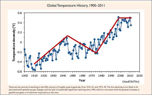
Source: Cato Institute
Temperatures have certainly gone up over the past 112 years, but not by tha much (looks like half a degree), and certainly not in a straight line.
There were two periods of rising temperatures (roughly 1910 to 1945, and then 1976 to 1998). Following 1945, there was roughly a 30-year period of generally falling temperatures, so that by the mid-1970s things were about where they were at start of the century.
Since 1998, temperatures have basically flat-lined despite some year to year to year flunctuations, and that flattening, different than many climatolgists expected, is what led IPCC researchers to amend their temperature models downward in the report.
That may or may not impact how severely if at all government regulations and costs to reduce greenhouse gasses will hit the supply chain.
What is really happening? Who knows. But at least the chart above gives us all a picture of what has really happened with temperatures over the last century plus.
Any Feedback on our Supply Chain Graphic of the Week? Let us know your thoughts at the Feedback button below.
|