|
For the last several years, I have been doing reporting and analysis on company and sector inventory levels based on the annual Working Capital scorecard that is compiled by REL, a division of the The Hackett Group.
It is always one of our most popular columns of the year.
Once again this year, REL has been kind enough to send me the data set for some further analysis. The just released 2013 data is based on year-end 2012 financials from 1000 US public companies.
The full report and data set looks at the full spectrum of working capital: Days Sales Outstanding (DSO), Days Inventory Outstanding (DIO), and Days Payables Outstanding (DPO). Here, we are going to focus on just the inventory component.
DIO means how many days of sales a company is holding in inventory, and which REL defines as:
End of Year Inventory Level/[total revenue/365]
I want to make clear this is the definition REL uses in its data set. Every year, someone writes in telling me why I am wrong here, and my response is that this is the way REL calculates DIO, so that is what I must therefore use (and I think it is fine anyway).
As such, DIO is sort of the reverse of inventory turns, in that a higher DIO, all things being equal, means poorer inventory management performance, while a lower number signals improvement. You are being more efficient with inventory versus a given level of sales.
So, let's take an example. Building products company Owens-Corning had about $5.1 billion billion in sales in 2012. Divided by 365 days in a year, that means the company sold about $14.1million worth of insulation and other stuff per day. It also ended the year with $786 million in inventory. So dividing that inventory number by the $14.1 million in sales per day means Owens-Corning held on average inventory equal to about 55.4 days of its sales. Office furniture maker Herman Miller , by contrast, manages to hold just about 15 sales day's worth of inventory. Best Buy held 41 days worth.
In case you were curious, Owens-Corning's 55.4 days of DIO could be compared to its inventory turns level of 5.5 days (Cost of Goods Sold divided by inventory levels). But you can by no means say every company with DIO of 55.4 has inventory turn of 5.5. The margins/cost of goods sold vary by company, making that linkage impossible.
In the overall US economy, inventory levels have remain relatively flat since about 2005, when compared to sales. As seen in the chart below, the "inventory to sales" ratio did spike in late 2008/early 2009 as the recession caught companies with way more inventory than needed versus suddenly shrinking demand, but they then chopped away at that inventory ruthlessly, so that it was back on the longer term trend line by early 2010. However, according to this government data, inventory levels, especially among retailers, popped up a bit in the second half of 2012 as shown below.

The leaves the overall inventory to sales ratio is now up a bit from recent lows in early 2011.
Now, back to the REL data. It is great, but the biggest value-add SCDigest performs here is to re-sort individual companies into new categories, so the categories and comparisons in our view are more usable for supply chain thinking. For example, home builders like Toll Brothers were mixed in the household durables category with companies like Whirlpool. That may have been the most "apples and oranges" combination, but there were a number of others that didn't quite jive, at least from a supply chain perspective. Metal producers such as US Steel were in the same category as miners.
So, we do the hard work of first eliminating sectors that aren't useful for the supply chain (e.g., bankers, etc.), and then redefining and populating the categories in a way that makes more sense for the supply chain. As another example, rather than having one giant category of all specialty retail, we broke that down into apparel, office products, etc. It really does take a lot of time.
 It is far from perfect. Should Johnson & Johnson be placed in the pharma group, the medical device category, or consumer packaged goods, as it does all of that? Is Honeywell in the aerospace or automotive sector, or one of the few "industrial conglomerates" like GE or 3M? That's where we put it this year. It is far from perfect. Should Johnson & Johnson be placed in the pharma group, the medical device category, or consumer packaged goods, as it does all of that? Is Honeywell in the aerospace or automotive sector, or one of the few "industrial conglomerates" like GE or 3M? That's where we put it this year.
In the end, we simply made choices, including looking up more details on a number of companies with which we were not familiar, and in some cases looking up the data ourselves for a handful of notable companies that were missing for some reason.
So
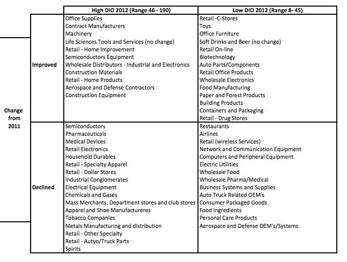
all that doesn't leave me much room here. You will find a complete table
of the almost 60 categories we used here, ranked from lowest DIO to highest,
and the change from 2011 to 2012: DIO By Sector 2012. Note: you may have to "zoom in" in your browser to see it well.
Top 5 lowest DIO: (1) Restaurants: 8; (2) Airlines:8; (3) Retail Convenience Stores: 9; (4) Retail Wireless Systems: 13; (5) Toys: 14
Top 5 highest: (1) Spirits:190; (2) Retail Auto Parts: 110; (3)
Retail: Other Specialty - 89; (4) Construction Equipment: 82; (5) Aerospace/Defense Components: 72.
Three best performing sectors (biggest drop in DIO from 2011 to 2012: (1) Construction Equipment: -11.9%; (2) Food Manufacturing: -10.7%; (3) Contract Manufacturers: -7.8%.
Three worst performing sectors (largest rise in DIO): (1) Spirits: 10.7%; (2) Electric Utilities: 9.9%; (3) Retail Wireless Services: 9.9%.
In
our On-Target newsletter next week, we will provide even more detail on
this data, also look at which individual
companies made big progress, such as sports apparel maker Under Armour, which managed to
drop DIO from 80 to 64 days last year, an improvement of 21%. Nice job.
We'll also detail which companies are in which sectors. Look for that next week.
Finally, I took a look at three specific sectors, using the same exact companies, for select years from 2004 through 2012.
Sector |
2004 |
2006 |
2011 |
20012 |
Change 2004 to 2013 |
Food Manufacturing |
39.35 |
37.46 |
41.2 |
39.6 |
0.6% |
Chemicals |
45.16 |
43.92 |
56.75 |
56.08 |
24.2% |
Mass Merchants/Dept Stores, Clubs |
70.9 |
61.45 |
59.63 |
59.72 |
-15.8% |
Is that progress or not? Will also do this analysis for additional sectors next week.
Any reaction to this year's inventory numbers? What other analysis would
you like to see? Let us know your thoughts at the Feedback section
below.
|


