So-called "infographics" are pretty hot right now, and SCDigest believes they are especially useful for many supply chain topics.
What is an infographic? Though there are certainly more official definitions, we'd say an infographic is simply a way to present a range of information (meaning, not a more limited scope data point, such as a pie chart) in a highly visual form, with the ultimate goal in effect of telling a story from several perspectives.
No question, at their best, infographics are highly effective.
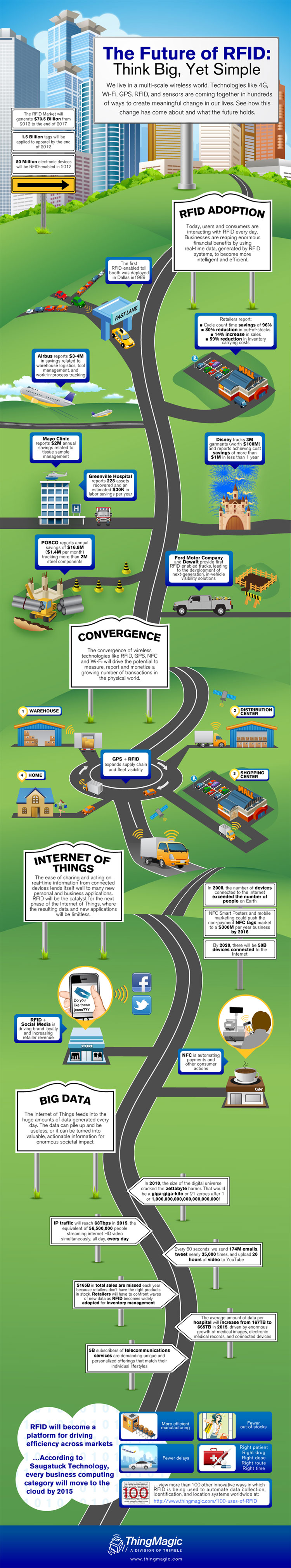
Presented below is a pretty good example of an infographic that accompanied a press release from RFID technology provider ThingMagic that announced a new RFID reader module (meaning a device that can be embedded in other pieces of equipment, such as a smart phone) that offers a smaller size and greater performance than previous modules.
The infographic is meant to tell the history of RFID and convince the audience that RFID technology really will ultimately be transformative for our supply chains. It is long (vertically) for a web page, but SCDigest thinks it is worth the space, both to illustrate the concept and to learn a little about RFID at the same time. It is well done.
RFID Infographic
SCDigest believes that not only are quality infographics great tools for supply chain related vendors, but can also be an excellent way to communicate internally within a supply chain or to executives for supply chain managers. Sure, this example was developed by professional designers, but we think with tools such as Visio or even Powerpoint, regular supply chain managers could do a pretty good job if they are graphically inclined.
In fact, many Lean "A3" documents are a form of infographic, just needing in some cases a little more style, but the basic concept is exactly the same.
Any Feedback on our Supply Chain Graphic of the Week? Let us know your thoughts at the Feedback button below.
|