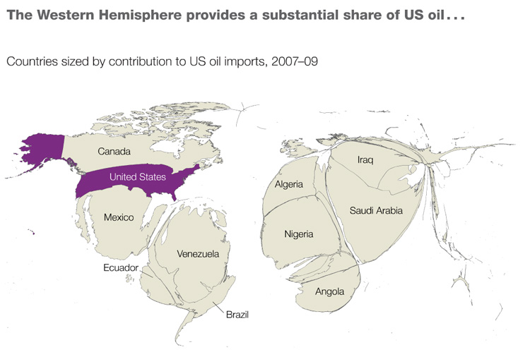
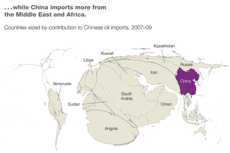
From what countries and regions do the world's two largest econonomies, the United States and China, source their oil needs?
We found this set of new charts from McKinsey on this subject quite interesting, not only for the information itself, but from the way the data was represented. As shown below, the size of each country and region on the two maps represents the share of oil being imported by the US and China respectively.
Source: McKinsey Quarterly
From these charts, it is clear China is in fact far more dependent on Middle East oil than is the United States, which produces a larger share of its own oil than does China, and imports a significant share of its needs from neighbors Canada and Mexico.
We were a bit surprised at the still large amount of oil the US imports from Venezuela, a country that the US has not exactly been great friends with of late.
Also not the US get no oil from Iran, whereas China sources a large portion of its needs there.
We also didn't realize Angola was such a major oil player.
The graphics shed some light generally on the flow of oil globally, and also where each country has different risks and interests that can clearly manifest themselves on the global political stage.
We also thought this type of chart, called a cartogram, was an interesting way to present data, and could be used in other supply chain contexts, actuaally with countries as the backdrop for things like sourcing or demand but even without a geographic frmaework, such as inventory levels by node or others ways.
Have a comment? Send it at the Feedback button below.
|