How high are oil prices today in historical context? That's an interesting question, but fortunately one recently answered in the just released BP Statistical Review of World Energy 2011.
Earlier this week, our TheGreenSupplyChain.com did a more thorough review of the 60th annual edition of this outstanding report, which you can find here:
Annual BP Review of World Energy Shows Sharp Rise in Energy Use in 2010, Worrisome Trends.
Also in the report was a look at absolute and relative oil prices over history, from the start of the oil era in the mid-1800s through the end of 2010. In the chart below, the dark green line represents the price of oil in the dollars of the day (hence very low for most of history), and the light green represents the price in 2010 dollars.
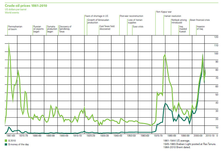
Source: BP's Statistical Review of World Energy 2011
As can be seen, forgetting for this disussion the very early days,oil prices in today's dollars were actually gradually declining for most of history, through the 1960's.
That changed rapidly in the 1970s, reaching relative prices in the late 1970s equal to the recent peaks, followed by a sharp (if temporary) sharp decline, in part fueling the strong ecomnomy of the 1990s.
Of course, the more recent the view, the more close the two lines will be, as the actual dollars and dollars relative to 2010 move towards equality.
In 2008, we reached a relative peak equal to the late 1970s, before declining a bit (but not much by historical standards) during the recession that followed.
Of course, the lines would have moved back up some more during 2010. Where from here? That is the trillion question.
|