|
For the last several years, I have been doing reporting and analysis on company and sector inventory levels based on the annual Working Capital scorecard that is compiled by REL, a division of the The Hackett Group.
It is always one of our most popular columns of the year.
Gilmore Says: |
 Of note, retail inventory levels have recently been declining, while manufacturing and wholesale inventories are rising. Of note, retail inventory levels have recently been declining, while manufacturing and wholesale inventories are rising. 

Click Here to See
Reader Feedback |
Once again this year, REL has been kind enough to send me the data set for some further analysis. The just released 2012 data (a little later than usual this year) is based on year-end 2011 financials from hundreds of US public companies.
The full report and data set looks at the full spectrum of working capital: Days Sales Outstanding (DSO), Days Inventory Outstanding (DIO), and Days Payables Outstanding (DPO). Here, we are going to focus on just the inventory component.
DIO means how many days of sales a company is holding in inventory, and which REL defines as:
End of Year Inventory Level/[total revenue/365]
I want to make clear this is the definition REL uses in its data set. Every year, someone writes in telling me why I am wrong here, and my response is that this is the way REL calculates DIO, so that is what I must therefore use (and I think it is fine anyways).
As such, DIO is sort of the reverse of inventory turns, in that a higher DIO, all things being equal, means poorer inventory management performance, while a lower number signals improvement. You are being more efficient with inventory versus a given level of sales.
So, let's take an example. Amazon.com had about $48 billion in sales in 2011 (wow). Divided by 365 days in a year, that means the company sold about $131 million worth of stuff per day. It also ended the year with $4.992 billion in inventory. So dividing that inventory number by the $131 million in sales per day means Amazon holds on average inventory equal to about 38 days of its sales. McDonald's, by contrast, manages to hold just about 2 sales day's worth of inventory (I assume franchisers hold much of the inventory in the chain, though the restaurant category has the lowest overall DIO); Goodyear Tire holds 62 day's worth.
In case you were curious, Amazon's 38 days of DIO could be compared to its inventory turns level of 7.46 days (Cost of Goods Sold divided by inventory levels). But you can by no means say every company with DIO of 38 has inventory turn of 7.5%. The margins/cost of goods sold vary by company.
In the overall US economy, inventory levels have remain relatively flat since about 2005. As seen in the chart below, the "inventory to sales" ratio did spike in late 2008/early 2009 as the recession caught companies with way more inventory than needed versus suddenly shrinking demand, but they then chopped away at that inventory ruthlessly, so that it was back on the longer term trend line by early 2010.
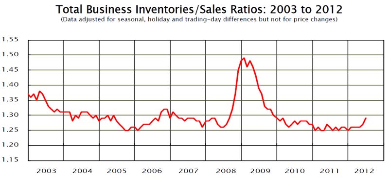
Just recently, the numbers have started to inch back up a bit, to a level of 1.28 in June (the most recent number), typical in a recovering economy. It is still well below levels prior to 2005, as supply chain management effectiveness and greater corporate focus on inventories have combined to drive the levels of inventory down overall, though we may have reached a plateau. Of note, retail inventory levels have recently been declining, while manufacturing and wholesale inventories are rising.
Now, back to the REL data. The biggest value add we perform here is to re-sort individual companies into new categories, so the categories and comparisons in our view are more usable for supply chain thinking. For example, home builders like Toll Brothers were mixed in the household durables category with companies like Whirlpool. That may have been the most "apples and oranges" combination, but there were a number of others that didn't quite jive, at least from a supply chain perspective. Metal producers such as US Steel were in the same category as miners.
So, we do the hard work of first eliminating sectors that aren't useful for the supply chain (e.g., bankers, etc.), and then redefining and populating the categories in a way that makes more sense for the supply chain. As another example, rather than having one category of all specialty retail, we broke that down into apparel, office products, etc. It really does take some time.
 It is far from perfect. Should SuperValu be placed with grocery retailers, or the food wholesalers category, as it does a lot of both? Is Honeywell in the aerospace or automotive sector, or maybe even one of the few "industrial conglomerates" like GE or 3M? It is far from perfect. Should SuperValu be placed with grocery retailers, or the food wholesalers category, as it does a lot of both? Is Honeywell in the aerospace or automotive sector, or maybe even one of the few "industrial conglomerates" like GE or 3M?
In the end, we simply made choices, including looking up more details on a number of companies with which we were not familiar, and looking up the data ourselves for a handful of notable companies that were missing for some reason (e.g., Lowes).
So
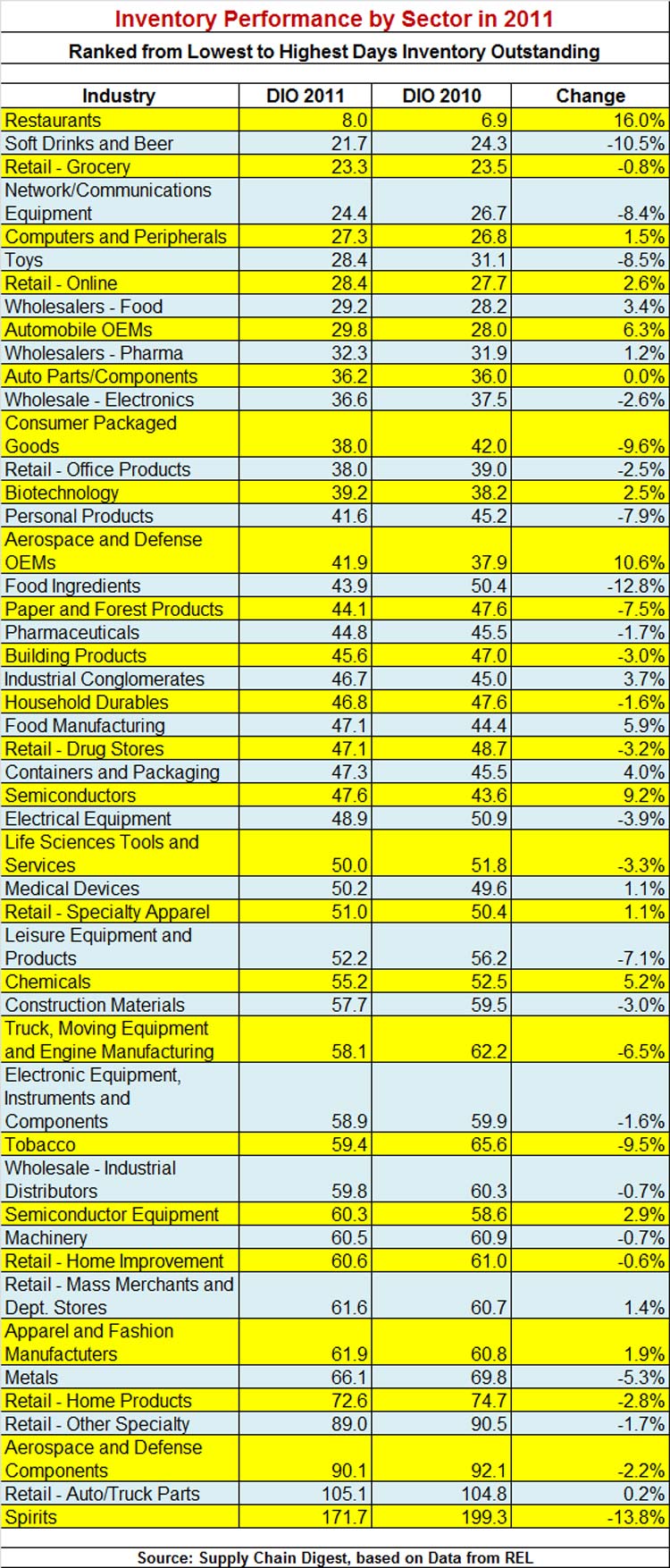
all that doesn't leave me much room here. You will find a complete table
of the 49 categories we used here, ranked from lowest DIO to highest,
and the change from 2010 to 2011: DIO By Sector 2012. Note: you may have to "zoom in" in your browser to see it well.
Top 5 lowest DIO: (1) Restaurants 8.0; (2) Soft Drinks/Beer 21.7; (3) Retail Grocery
23.3; (4) Network Equipment (e.g., Cisco) 24.4; (5) Computers 27.3.
Top 5 highest: (49) Spirits 171.7; (48) Retail Auto Parts 105.1;(47)
Aerospace/Defense Components 90.1; (46) Retail Other Speciality (e.g.,
PetSmart) 89.0; (45) Retail Home Products (e.g., Bed Math & Beyond)
72.6.
Three best performing sectors (biggest drop in DIO from 2010 to 2011: (1) Spirits -13.8%; (2) Food Ingredients -12.8%; (3) Soft Drinks/Beer -10.5%.
Three worst performing sectors (largest rise in DIO): (49) Restaurants 16.0%; (48) Aerospace/Defense OEMs (e.g., Boeing) 10.6%; (47) Semiconductors 9.2%.
Note the companies cited as examples could have seen changes different from overall sector average.
In
our On-Target newsletter next week, we will provide even more detail n
this data. Also, REL provided only two years worth of data this year
instead of the usual three, but I am going to see if we can combine that
with last year's data to provide a more multi-year view (it will be a
big effort, actually.) Next week, we will also look at which individual
companies made big progress, such as Monster Beverage, which managed to
drop DIO from 43 to 33 days last year, an improvement of 22%. Nice job.
We'll also detail which companies are in which sectors. Look for that next week.
REL
says the top 1000 US-headquartered public companies still had over
$910 billion tied up in working capital capital in 2011, much of that in
inventory, and that there are major opportunities for many companies to
capture some of that as cash.
We agree.
Any reaction to this year's inventory numbers? What other analysis would
you like to see? Let us know your thoughts at the Feedback section
below.
|

